Skip to Content
  1. Visualnest Agency
  2. Case Study
  3. Pure Hope
Case Study — Branding 2025

Pure Hope

Natural Beverage Case Study

A complete brand identity for Pure Hope — a premium natural drinking and beverage company built on purity, wellness, and eco-friendly refreshment. Clean logo, organic leaf elements, and a green palette that stands out in the competitive beverage market.
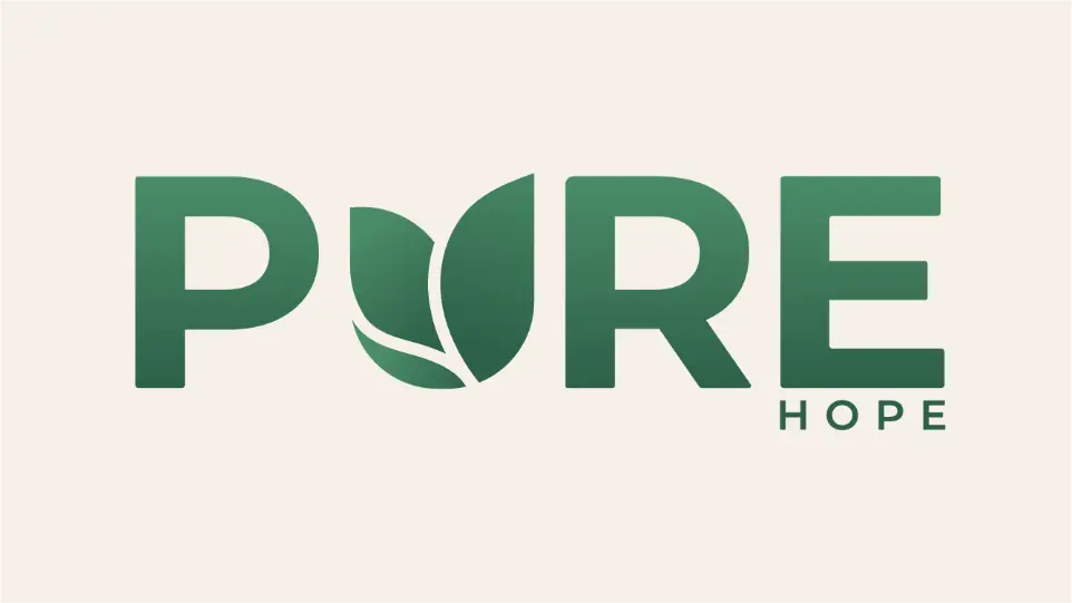
  • Brand Identity
  • Logo Design
  • Visual Identity
  • Packaging
  • Natural Beverage
Client
Pure Hope
Category
Branding
Year
2025
Pure Hope brand identity design by Visualnest Agency — natural beverage branding
Industry
Natural Beverages
Drinking & Wellness Drinks
Deliverables
Full Brand Identity
Logo · Color System · Typography · Visual Identity
Design Approach
Minimalist & Organic
Clean · Nature-Inspired · Premium
Completed
December 2025
Visualnest Agency · Branding Project
PROJECT SUMMARY

Bottling nature's essence

The branding design for Pure Hope focuses on purity, wellness, and eco-friendly refreshment through a clean, minimalist logo featuring organic leaf elements that symbolize natural hydration, freshness, and trust. The green palette and refined typography reinforce the brand's unwavering commitment to sustainability, healthy ingredients, and purity — helping it stand out in the competitive premium beverage market.

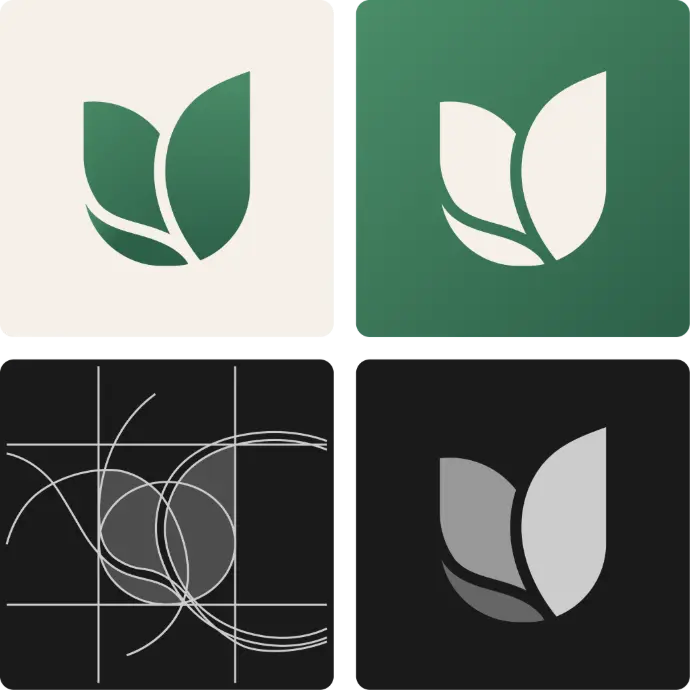
Logo anatomy & breakdown

Inspired by the brand's confidence and clarity, this mark combines strong lines and clean typography. The icon can stand alone or pair with brand's name.

Leaves: Each leaf expresses the emotion of calmness, freshness, start  of something new and essence of nature.


Colour Variations 

Brand Pillars

What Pure Hope stands for

Pure Hope is a premium, nature-inspired beverage brand built on three core principles — values that shape every design decision, from the logo mark to the full visual identity system.

  • Purity

    Every visual element communicates clean, unprocessed, and honest ingredients — a transparent promise to the consumer embedded in every detail of the brand.

    • Clean Ingredients
    • Transparency
    • Natural
  • Wellness

    Designed for the health-conscious consumer who treats hydration as a daily ritual — where premium quality meets purposeful, wellness-driven choices.

    • Health-Conscious
    • Hydration
    • Premium
  • Sustainability

    Eco-conscious values reflected not just in product formulation but woven into the visual language — a brand that respects both people and the planet.

    • Eco-Friendly
    • Green Design
    • Responsible
Color System

The palette of nature

A curated range of greens flowing from deep forest to pale morning dew, anchored by warm cream. Each color is chosen to evoke freshness, life, and premium naturalism — reflecting Pure Hope's commitment to clean, honest ingredients.

  • Night Grove #1A3A2A Primary Background · Deep Anchor
  • Forest Deep #2D6048 Primary Brand Color · Logo
  • Fresh Leaf #4A8C68 Accent · CTA · Highlights
  • Spring Mist #A8D4B8 Supporting · Borders · Tags
  • Morning Dew #D4EAD9 Light Backgrounds · Hover States
  • Pure Cream #F5F0E8 Base · Text on Dark · Cards