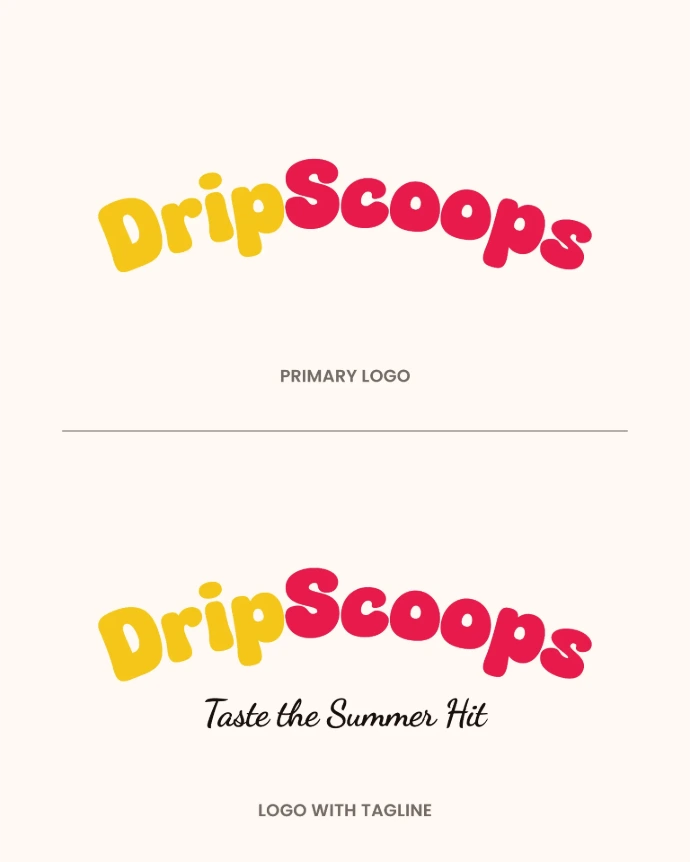
Skip to Content
Case Study — Brand Identity

DripScoops
Brand Identity
System

A bold, Gen-Z ice cream brand designed for social-first discovery. Visualnest built the complete identity — from logo to packaging — for DripScoops' 2026 launch.

Branding Packaging Logo Design Typography
DripScoops brand identity hero visual

The Brief

Crafting a brand that tastes as good as the scoops

The Challenge

DripScoops was launching in 2026 as a new ice cream brand targeting Gen-Z consumers in Tier 1 and Tier 2 Indian cities. The founder needed a full brand identity that could stand out on Instagram feeds, look irresistible on packaging, and communicate "premium indulgence" without feeling stiff or corporate.

The name itself — DripScoops — carried cultural currency. Our job was to make the visual system live up to the name: dripping with personality, colour, and boldness.

Client

DripScoops

Industry

Food & Beverage — Ice Cream

Deliverables

Logo System · Brand Identity · Typography · Colour Palette · Packaging Design · Social Media Templates

Year

2026

Logo Design

A mark built to drip

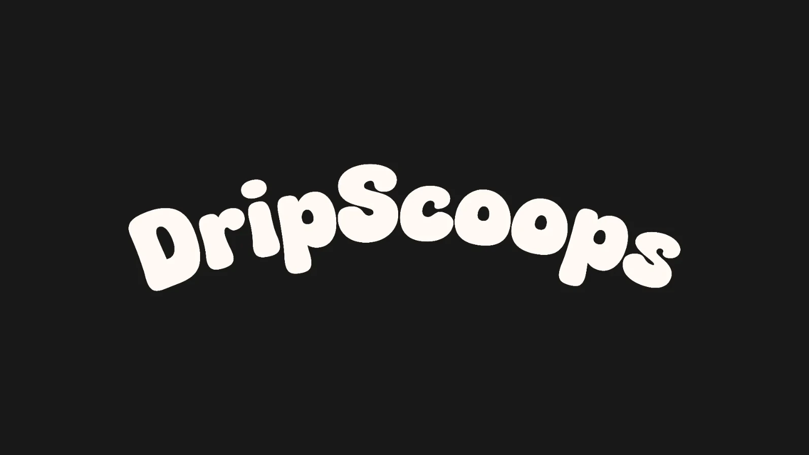
The DripScoops logo fuses a playful ice cream scoop icon with a bold wordmark. Rounded letterforms signal warmth and approachability — balanced by high-contrast weight for instant shelf recognition and social media impact.

DripScoops primary logo
DripScoops inverted logo on yellow background
DripScoops inverted logo on pink background
DripScoops logo monochrome on dark backhround

Brand Colours

Colour that pops — literally

Every colour was chosen to trigger appetite, excitement, and shareability on screens and packaging alike. Bold contrasts. Zero boredom.

Primary Palette

Scoops Yellow

#F4C51B

R 244 · G 197 · B 27

Primary Brand Colour

Gen-Z Pink

#E71B4C

R 231 · G 27 · B 76

Secondary Brand Colour

Acadia Brown

#1C120D

R 28 · G 18 · B 13

Tagline

Cream Bliss

#FFF7F0

R 255 · G 247 · B 240

Background & Base

Dark Cone

#1A1A1A

R 26 · G 26 · B 26

Type & Dark Mode

Flavour Accents

Pista Green

#4CAF50

Berry Blaze

#9C27B0

Blue Velvet

#2196F3

Mango Drip

#FFC107

Choco Fudge

#795548

Typography System

Type that speaks Gen-Z

Three typefaces work in concert — playful headlines, a bold handwritten accent, and clean readable body text — creating a system that feels energetic but never chaotic.

Display

Fredoka One

Drip It. Lick It.

Role

Campaign Headlines · Hero Text

Weight

Regular (400) — only weight available

Size Range

48px – 120px

Accent

Dancing Script

Pure happiness in every scoop

Role

Handwritten Accent · Taglines · Packaging Callouts

Weight

Bold (700)

Size Range

24px – 72px

Body

Poppins

Heading — ExtraBold 800

Subheading — Bold 700

Label / Caption — SemiBold 600

Body copy — Regular 400. Clean, rounded, and modern. Poppins handles all descriptive text, ingredient lists, nutritional labels, and UI copy across digital and print applications.

Role

UI Text · Body Copy · Labels · Supporting Headings

Weights Used

400 · 600 · 700 · 800

Packaging Design

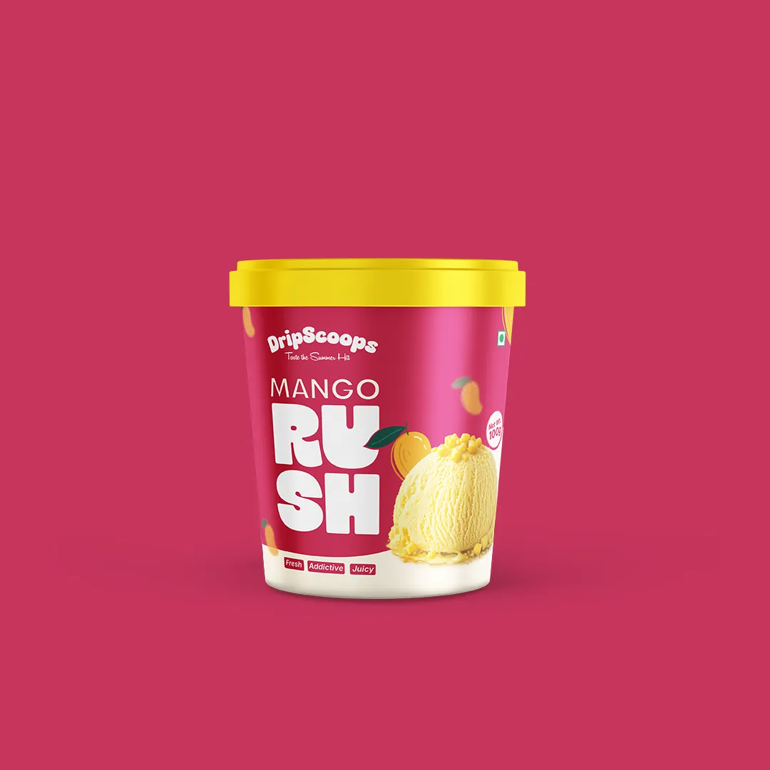
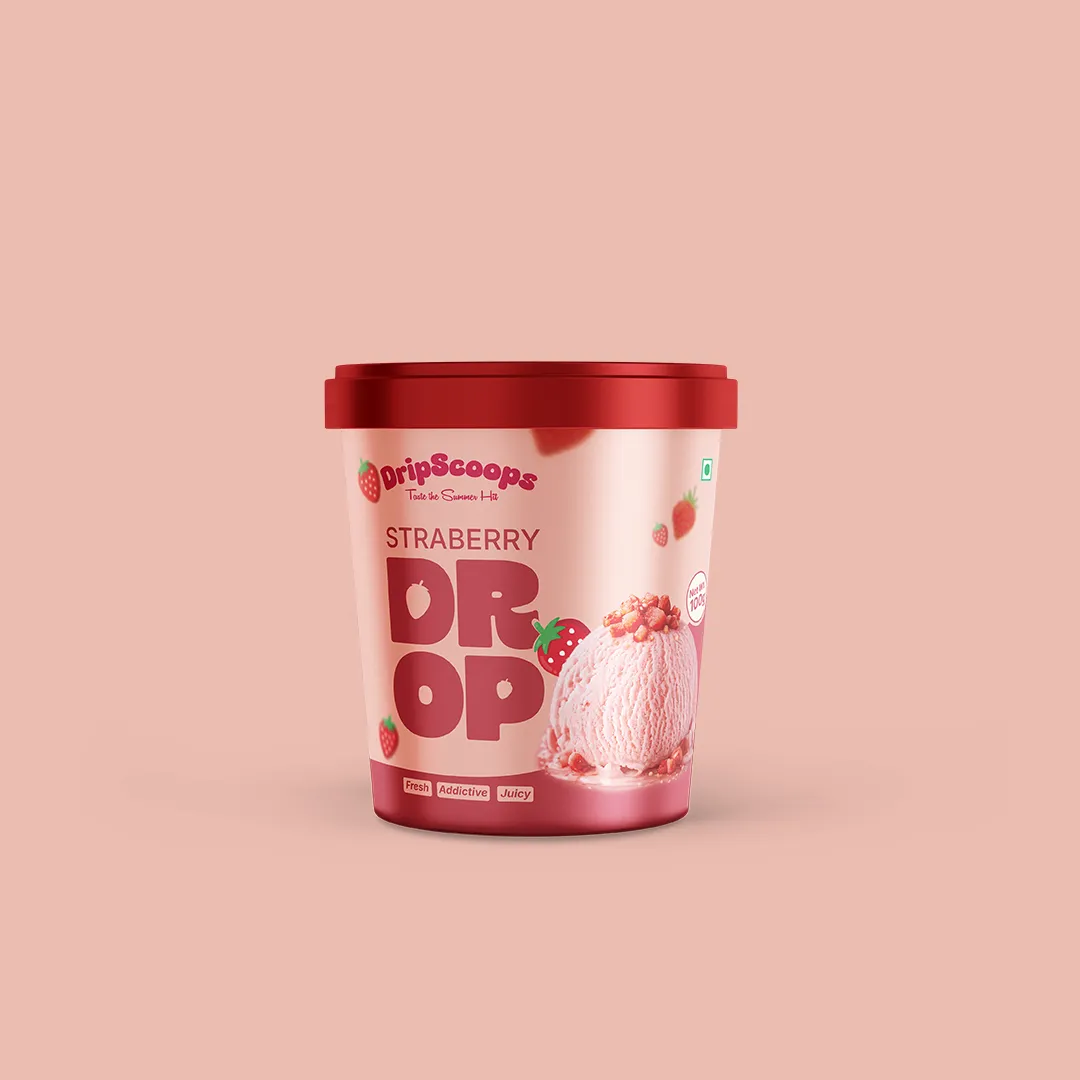
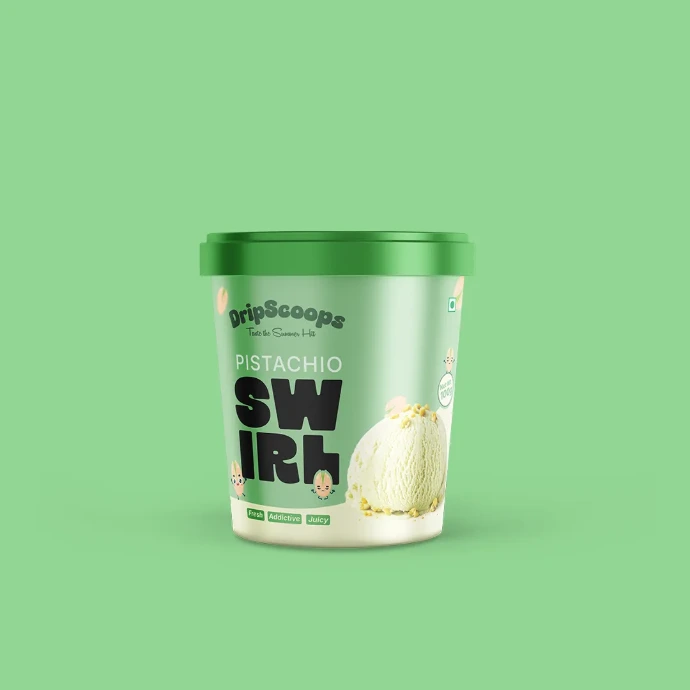
Packaging that sells on the shelf and the feed

Each flavour variant gets its own colour-coded identity — bold enough to stop a scroll, structured enough to stack on shelves. The packaging system is designed for print, social, and unboxing moments.

DripScoops Classic Orange flavour packaging design
DripScoops Berry Bomb flavour packaging design
DripScoops Pista Rush flavour packaging design

Colour Coding

Each flavour owns a distinct colour — no confusion on shelves or in photos.

Print Ready

All files delivered in CMYK with 3mm bleed, ready for offset and digital print.

Social Native

High-contrast gradients designed to pop on Instagram and product listing pages.

Brand in Use

Built for social-first discovery

Every element of the DripScoops identity was pressure-tested against a 1×1 Instagram square. If it doesn't work on a phone screen, it doesn't make the cut.

DripScoops Social Post Template 01
DripScoops Social Post Template 02
DripScoops Social Post Template 03
DripScoops Social Post Template 04

Brand Guidelines Applied

Every template ships with the Brand Kit

Visualnest delivered 10 ready-to-edit PSD social templates — Stories, Feed Posts, and Reels covers — all locked to the DripScoops brand system. The founder's team can post without a designer.

  • 10 PSD social templates
  • Feed posts · Stories · Reel covers
  • Brand Kit file with all colours and fonts
  • Editable by non-designers
DripScoops Special Social Post Template

Our Process

From brief to brand in 4 phases

Visualnest uses a structured, collaborative process to ensure every brand decision is intentional — and every deliverable is ready to use from day one.

01

Discovery & Brand Audit

We started by understanding DripScoops' vision, target audience, and competitive landscape. We mapped the Gen-Z food brand space across Instagram to identify white space — what no one else was doing.

Audience Research Competitor Mapping Brand Questionnaire
02

Moodboard & Direction

Three visual directions were presented — each with a distinct personality: Retro Parlour, Bold Gen-Z Street, and Premium Artisan. The client chose Bold Gen-Z Street. We locked the direction and moved forward.

Moodboards × 3 Colour Exploration Typography Pairing
03

Design & Refinement

Logo concepts were developed, refined across two revision rounds, and tested at multiple scales — from 16px favicon to 1-metre flex banner. Packaging layouts followed, with each flavour variant pressure-tested in print-simulation mockups.

Logo Design Unlimited Revisions Packaging Design
04

Delivery & Brand Handoff

Final assets delivered as a complete Brand Kit: vector files (AI, SVG, EPS), print-ready PDFs (CMYK, with bleed), web-optimised PNGs, and a Brand Guidelines PDF covering all usage rules. The client can brief any printer or designer anywhere with confidence.

CDR · SVG · EPS Files Print PDFs (CMYK) Brand Guidelines PDF PSD Templates

Project Outcomes

A brand ready for launch day

DripScoops launches in 2026 with a complete brand system — built to scale from local pop-up to city-wide distribution without a redesign.

5+

Flavour packaging
variants designed

10

Social media
templates delivered

3

Typefaces in the
brand system

1

Brand that's ready
for city-wide launch

"Visualnest gave DripScoops an identity that's bold enough for Gen-Z but structured enough to work across every touchpoint — from cup to Photoshop to retail shelf. We launched with confidence."

Kiara Verma

DripScoops, India · 2026

Ready to Build Your Brand?

Let's make your brand
the next case study

Visualnest is a branding and graphic design studio based in Siliguri, North Bengal. We work with Indian startups, SMBs, and D2C brands to build identities that are bold, scalable, and built for real business outcomes.

Logo Design Brand Identity Packaging Design Social Media Creatives Web Design